Ubuntunion: 正在设计的 Ubuntu 8.10 新主题
上一次我们在曝光 Ubuntu 8.10 Alpha 1 时,曾提到其中包含了一个新的 NewHuman 主题,不过有很多朋友对它并不满意。据说,又一个新主题正在设计中,该主题名为 Ubuntunion,意图将 GTK 与 Metacity/Emerald 主题统一起来。这个主题是否会博得 Ubuntu 粉丝的芳心呢?
这套 Ubuntunion 主题共包括三种样式,让我们一起来看看 Ubuntunion 的设计样子:
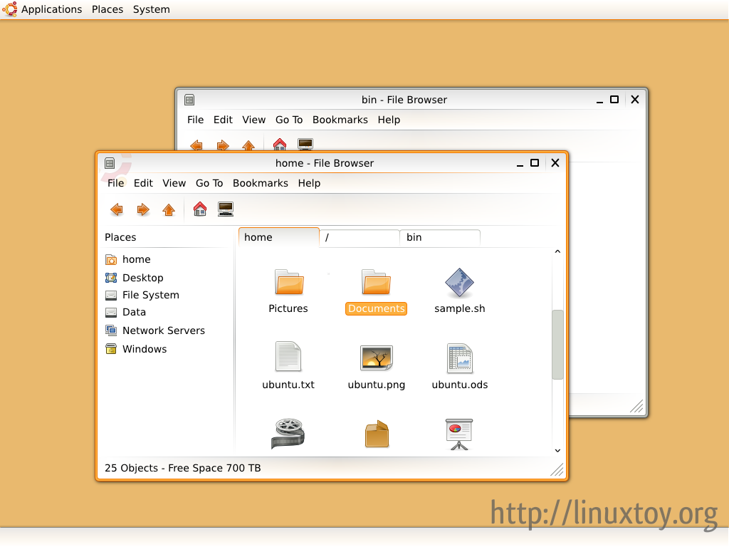
Ubuntunion
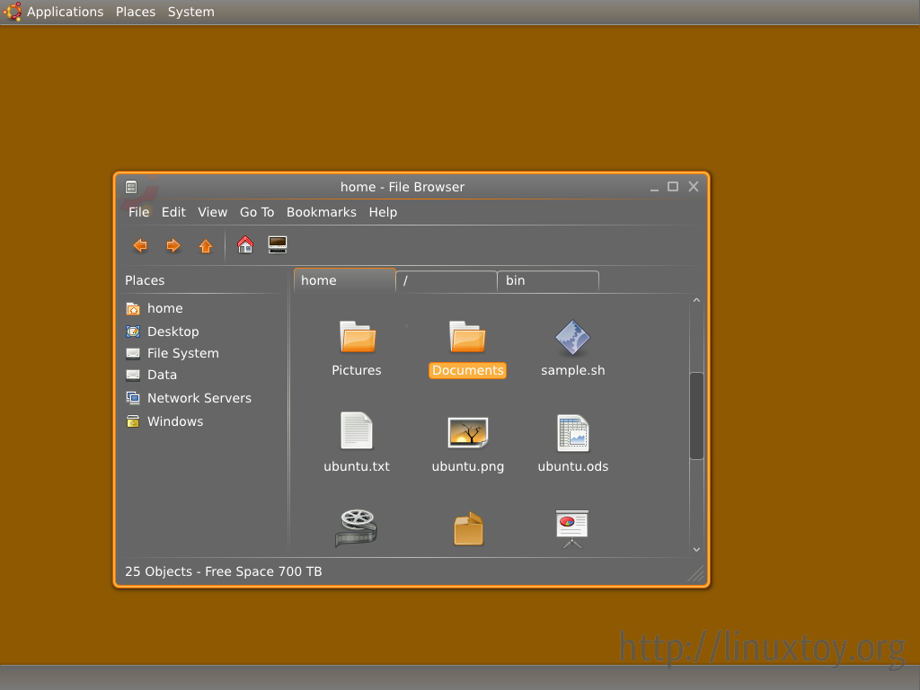
Dark edition
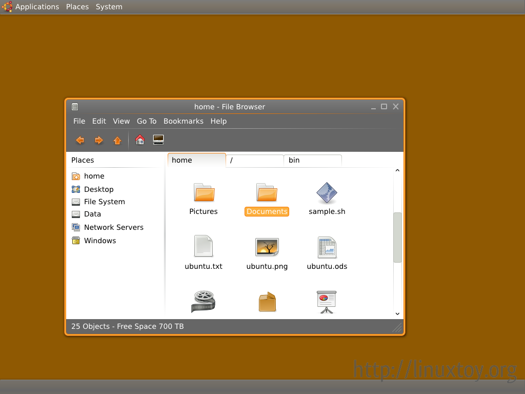
Half dark edition
有关 Ubuntunion 的设计过程详见 Ubuntu Wiki。